As Project Manager for ImagiNation, a Grants for the Arts funded project in ten library authorities in the east of England, I created a range of advocacy and training documents for library staff who would be delivering the activity to participating 11-18 year olds. The core of the activity was to encourage young people to respond creatively to books they had read for pleasure. During the first year of the activity, it was established that keeping artists embedded as much as possible would be key to the successful development of the project. It was also established that staff needed more help understanding the breadth of creative approaches the young people might take. As part of creating the training and arts advocacy pack, I turned to my own practice to include an example of an artist’s creative response to reading for pleasure. I wanted to share the process I went through as much as the visual outcome itself. Below is the process and outcome I shared.
Colour Portrait of a Book (and the reader’s imagination?)
I skim-read the first hundred pages of two very different novels, writing down every colour that was mentioned.
Sometimes I made a note next to the colour about what it referred to, to help me remember and choose an appropriate shade later, e.g. ‘red: face’ would be very different from ‘red: pillar box’. I kept the colours in sequence, meaning sometimes the same colour would appear several times in a row. I mostly chose to ignore names (e.g. Mr Brown), although in the Gibson book below, I included ‘Blue Ant’ the name of a company, as there was significant description of the logo.
Next step was to turn the words into actual colours. When I came to choose a colour, if I was unsure, I would use a google image search to inspire me, or go with my imagination- what had I seen in my mind’s eye when reading? For silver and gold, I actually copied small sections of photos, as they can’t be shown as flat colours.
The decision to use a layout of squares was based on my previous art practice. Likewise, using Windows Paint as a simple tool to explore colour and shape. Oddly, it happened that there were a similar number of colours in both lists, which fitted a square perfectly: 169, which is 13 x 13. I think this idea would work equally well on squared paper, in coloured pencils or felt pens, say, or as a collage, perhaps by finding colours in a magazine, cutting out small squares and sticking them down.
Spook Country, by William Gibson
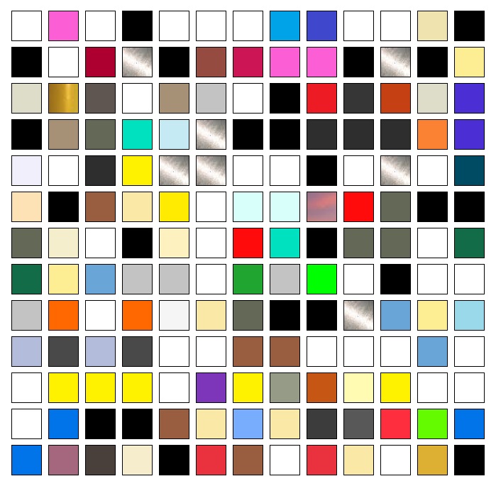
This is the book I was reading when I first had this ‘colours’ idea. I noticed Gibson mentioned colours a lot. Initially I spotted lots of whites, blacks, greys and silvers which set the scene, suiting perhaps the cyberpunk genre. He also explores themes about art in a conceptual way. The book was instrumental in conceiving my artistic idea.
The set has come out much more colourful that I expected, however there is a definite ‘artificial’ feel to the colours- they don’t suggest rural landscapes, say.
Gibson often uses a formula whereby he tracks different characters in alternating chapters, whose paths only come together near the end of the book. In this story, a particular character is often associated with a ‘grey-green non-colour’ found on the military-style equipment he uses. This colour is dotted fairly evenly throughout the set. Another character has blue eyes and blond hair and again, you can see how he appears periodically, starting about half way down.
Clock Without Hands, by Carson McCullers
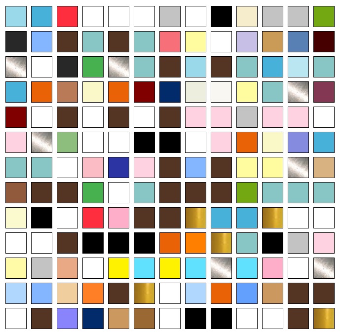
This book deals with race issues in the American south in the mid 20th Century. I started my colour list then realised my formula was not capturing the references to African American skin, because of the euphemistic terms used such as ‘coloured’ and ‘Nigra’. I had to think about how I would deal with this. I decided to use black if the word ‘black’ was used, and a very dark brown for the other terms. ‘White’ of course also refers to skin but is also not a visual representation of caucasian skin. This led me to question how I should represent it. I stuck to actual white to acknowledge the symbolic imbalance. I found it very interesting how my process became entangled with the prejudices explored by the story.
A key character is a young man who is black, with blue eyes. These grey-blue eyes, the blue eyes of an old confederate judge (and also the blue sky) feature frequently in the colour set, alongside the auburn hair and pallor of another character. Although at first glance the sets for the two books are similar, on closer inspection this one seems to me softer-less ‘mechanised’ and more human.
Pride and Prejudice
Another interesting discovery: Pride and Prejudice (my original choice for second book) was a non-starter- Austen mentions colour only once in the first 15 pages. The mention itself illustrates perfectly her apparent view that colour descriptions are unimportant: she wryly comments that all the girls were able to observe of Bingley was that ‘he wore a blue coat and rode a black horse’. Whilst I could previously have pointed out that the dialogue and character observations are the most important things in the text, reading it ‘visually’ in this way really crystallised that point for me in a new way.